- 引导布局
- Bootstrap - 断点
- Bootstrap - 容器
- Bootstrap - 网格系统
- Bootstrap - 列
- Bootstrap - 排水沟
- Bootstrap - 实用程序
- Bootstrap - Z 索引
- Bootstrap - CSS 网格
- 引导组件
- Bootstrap - 手风琴
- Bootstrap - 警报
- Bootstrap - 徽章
- Bootstrap - 面包屑导航
- Bootstrap - 按钮
- Bootstrap - 按钮组
- Bootstrap - 卡片
- Bootstrap - 轮播
- Bootstrap - 关闭按钮
- Bootstrap - 折叠
- Bootstrap - 下拉菜单
- Bootstrap - 列表组
- Bootstrap - 模态
- Bootstrap - 导航栏
- Bootstrap - 导航和选项卡
- Bootstrap - Offcanvas
- Bootstrap - 分页
- Bootstrap - 占位符
- Bootstrap - 弹出窗口
- Bootstrap - 进展
- Bootstrap-Scrollspy
- Bootstrap - 旋转器
- Bootstrap - 吐司
- Bootstrap - 工具提示
- 引导表单
- Bootstrap - 表单
- Bootstrap - 表单控制
- 引导程序 - 选择
- Bootstrap - 支票和收音机
- Bootstrap - 范围
- Bootstrap - 输入组
- Bootstrap - 浮动标签
- Bootstrap - 布局
- 引导程序 - 验证
- 引导助手
- Bootstrap-Clearfix
- Bootstrap - 颜色和背景
- Bootstrap - 彩色链接
- Bootstrap - 聚焦环
- Bootstrap - 图标链接
- Bootstrap - 位置
- Bootstrap - 比率
- Bootstrap - 堆栈
- Bootstrap - 拉伸链接
- Bootstrap - 文本截断
- Bootstrap - 垂直规则
- Bootstrap - 视觉隐藏
- 引导实用程序
- Bootstrap - 背景
- Bootstrap - 边框
- Bootstrap - 颜色
- Bootstrap - 显示
- Bootstrap-Flex
- Bootstrap - 浮动
- Bootstrap - 交互
- 引导程序 - 链接
- Bootstrap - 对象拟合
- Bootstrap - 不透明度
- Bootstrap - 溢出
- Bootstrap - 位置
- Bootstrap - 阴影
- Bootstrap - 尺寸调整
- Bootstrap - 间距
- Bootstrap - 文本
- Bootstrap - 垂直对齐
- Bootstrap - 可见性
- 引导演示
- Bootstrap - 网格演示
- Bootstrap - 按钮演示
- Bootstrap - 导航演示
- Bootstrap - 博客演示
- Bootstrap - 滑块演示
- Bootstrap - 轮播演示
- Bootstrap - 标头演示
- Bootstrap - 页脚演示
- Bootstrap - 英雄演示
- Bootstrap - 特色演示
- Bootstrap - 侧边栏演示
- Bootstrap - 下拉菜单演示
- Bootstrap - 列表组演示
- Bootstrap - 模态演示
- Bootstrap - 徽章演示
- Bootstrap - 面包屑演示
- Bootstrap - Jumbotrons 演示
- Bootstrap-粘性页脚演示
- Bootstrap-相册演示
- Bootstrap-登录演示
- Bootstrap 定价演示
- Bootstrap-Checkout 演示
- Bootstrap-产品演示
- Bootstrap-封面演示
- Bootstrap-仪表板演示
- Bootstrap-粘性页脚导航栏演示
- Bootstrap-Masonry 演示
- Bootstrap-Starter 模板演示
- Bootstrap-Album RTL 演示
- Bootstrap-Checkout RTL 演示
- Bootstrap-Carousel RTL 演示
- Bootstrap-博客 RTL 演示
- Bootstrap-仪表板 RTL 演示
- Bootstrap 有用资源
- Bootstrap - 问题与解答
- Bootstrap - 快速指南
- Bootstrap - 有用的资源
- Bootstrap - 讨论
Bootstrap - 快速指南
Bootstrap - 概述
什么是 Twitter Bootstrap?
Bootstrap 是一个时尚、直观且功能强大的移动优先前端框架,可实现更快、更轻松的 Web 开发。它使用 HTML、CSS 和 Javascript。
历史
Bootstrap 由Twitter的Mark Otto和Jacob Thornton开发。它于 2011 年 8 月作为开源产品在 GitHub 上发布。
为什么使用引导程序?
移动优先方法- Bootstrap 3 框架由整个库中的移动优先样式组成,而不是在单独的文件中。
浏览器支持- 所有流行的浏览器都支持。

易于入门- 只需具备 HTML 和 CSS 知识,任何人都可以开始使用 Bootstrap。Bootstrap 官方网站也有很好的文档。
响应式设计- Bootstrap 的响应式 CSS 可适应台式机、平板电脑和手机。有关响应式设计的更多信息,请参阅Bootstrap 响应式设计一章。
为开发人员构建界面提供干净、统一的解决方案。
它包含美观且实用的内置组件,易于定制。
它还提供基于网络的定制。
最重要的是它是开源的。
Bootstrap 包包含哪些内容?
脚手架- Bootstrap 提供了带有网格系统、链接样式和背景的基本结构。Bootstrap 基本结构部分详细介绍了这一点
CSS - Bootstrap 具有全局 CSS 设置、通过可扩展类进行样式化和增强的基本 HTML 元素以及高级网格系统的功能。Bootstrap with CSS部分详细介绍了这一点。
组件- Bootstrap 包含十多个可重用组件,旨在提供图标、下拉菜单、导航、警报、弹出窗口等。布局组件部分对此进行了详细介绍。
JavaScript 插件- Bootstrap 包含十多个自定义 jQuery 插件。您可以轻松地将它们全部包含在内,或一一包含在内。Bootstrap 插件部分对此进行了详细介绍。
自定义- 您可以自定义 Bootstrap 的组件、LESS 变量和 jQuery 插件以获得您自己的版本。
Bootstrap - 环境设置
设置和开始使用 Bootstrap 非常容易。本章将解释如何下载和安装 Bootstrap。我们还将讨论 Bootstrap 文件结构,并通过示例演示其用法。
下载引导程序
您可以从https://getbootstrap.com/下载最新版本的 Bootstrap 。当您点击此链接时,您将看到如下屏幕 -
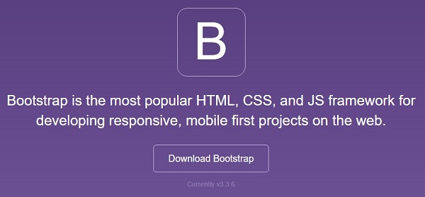
在这里你可以看到两个按钮 -
下载 Bootstrap - 单击此按钮,您可以下载 Bootstrap CSS、JavaScript 和字体的预编译和缩小版本。不包含任何文档或原始源代码文件。
下载源代码- 单击此按钮,您可以直接从 GitHub 获取最新的 Bootstrap LESS 和 JavaScript 源代码。
如果您使用 Bootstrap 的未编译源代码,则需要编译 LESS 文件以生成可用的 CSS 文件。为了将 LESS 文件编译成 CSS,Bootstrap 官方仅支持 Recess,这是 Twitter 基于less.js的 CSS 提示器。
为了更好地理解和易用性,我们将在整个教程中使用 Bootstrap 的预编译版本。由于文件已编译并缩小,因此您不必每次都为单独的功能添加单独的文件。在撰写本教程时,已下载最新版本 (Bootstrap 3)。
文件结构
预编译引导程序
下载编译版本的 Bootstrap 后,解压 ZIP 文件,您将看到以下文件/目录结构 -
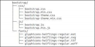
正如你所看到的,有编译后的 CSS 和 JS (bootstrap.*),以及编译和缩小后的 CSS 和 JS (bootstrap.min.*)。包括 Glyphicons 的字体,因为它是可选的 Bootstrap 主题。
引导程序源代码
如果您已经下载了 Bootstrap 源代码,那么文件结构将如下所示 -
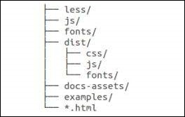
less/、js/和fonts/下的文件分别是 Bootstrap CSS、JS 和图标字体的源代码。
dist /文件夹包含上面预编译下载部分中列出的所有内容。
docs-assets/、Examples/和所有*.html文件都是 Bootstrap 文档。
HTML模板
使用 Bootstrap 的基本 HTML 模板如下所示 -
<!DOCTYPE html>
<html>

   <head>
      <title>Bootstrap 101 Template</title>
      <meta name = "viewport" content = "width = device-width, initial-scale = 1.0">

      <!-- Bootstrap -->
      <link href = "css/bootstrap.min.css" rel = "stylesheet">

      <!-- HTML5 Shim and Respond.js IE8 support of HTML5 elements and media queries -->
      <!-- WARNING: Respond.js doesn't work if you view the page via file:// -->

      <!--[if lt IE 9]>
      <script src = "https://oss.maxcdn.com/libs/html5shiv/3.7.0/html5shiv.js"></script>
      <script src = "https://oss.maxcdn.com/libs/respond.js/1.3.0/respond.min.js"></script>
      <![endif]-->

   </head>

   <body>
      <h1>Hello, world!</h1>

      <!-- jQuery (necessary for Bootstrap's JavaScript plugins) -->
      <script src = "https://code.jquery.com/jquery.js"></script>

      <!-- Include all compiled plugins (below), or include individual files as needed -->
      <script src = "js/bootstrap.min.js"></script>

   </body>
</html>
在这里您可以看到jquery.js、bootstrap.min.js和bootstrap.min.css文件,这些文件用于将普通的 HTM 文件制作为 Bootstrapped 模板。只需确保在包含 Bootstrap 库之前包含 jQuery 库即可。
有关上述代码中每个元素的更多详细信息将在Bootstrap CSS 概述一章中讨论。
例子
现在让我们尝试使用上述模板的示例。使用我们网站上以下示例代码框右上角提供的“实时演示”选项尝试以下示例 -
<h1>Hello, world!</h1>
在所有后续章节中,我们都使用了https://www.lipsum.com/网站上的虚拟文本。
Bootstrap - 网格系统
在本章中,我们将讨论 Bootstrap 网格系统。
什么是网格?
正如维基百科所说 -
在图形设计中,网格是一种结构(通常是二维的),由一系列相交的直线(垂直、水平)组成,用于构建内容。它广泛用于印刷设计中的布局和内容结构设计。在网页设计中,使用 HTML 和 CSS 快速有效地创建一致的布局是一种非常有效的方法。
简单来说,网页设计中的网格组织和构造内容,使网站易于浏览并减轻用户的认知负担。
什么是 Bootstrap 网格系统?
正如网格系统 Bootstrap 的官方文档所述 -
Bootstrap 包括一个响应式、移动优先的流体网格系统,随着设备或视口尺寸的增加,该系统可以适当地扩展到 12 列。它包括用于简单布局选项的预定义类,以及用于生成更多语义布局的强大 mixin。
让我们来理解一下上面的说法。Bootstrap 3 是移动优先,因为 Bootstrap 的代码现在首先针对较小的屏幕(如移动设备、平板电脑),然后“扩展”组件和网格以适应较大的屏幕(如笔记本电脑、台式机)。
移动优先策略
内容
- 确定什么是最重要的。
布局
- 首先设计较小的宽度。
- 基本 CSS 首先寻址移动设备;平板电脑、台式机的媒体查询地址。
渐进增强
- 随着屏幕尺寸的增加添加元素。
Bootstrap网格系统的工作原理
网格系统用于通过一系列容纳内容的行和列来创建页面布局。Bootstrap 网格系统的工作原理如下:
行必须放置在.container类中,以便正确对齐和填充。
使用行创建水平列组。
内容应放置在列内,并且只有列可以是行的直接子级。
预定义的网格类(如.row 和 .col-xs-4)可用于快速制作网格布局。LESS mixin 也可用于更多语义布局。
列通过填充创建装订线(列内容之间的间隙)。该填充通过.rows上的负边距在第一列和最后一列的行中偏移。
网格列是通过指定您希望跨越的十二个可用列的数量来创建的。例如,三个相等的列将使用三个.col-xs-4。
媒体查询
媒体查询是“条件 CSS 规则”的一个非常奇特的术语。它只是根据规定的某些条件应用一些 CSS。如果满足这些条件,则应用该样式。
Bootstrap 中的媒体查询允许您根据视口大小移动、显示和隐藏内容。以下媒体查询在 LESS 文件中使用,以在 Bootstrap 网格系统中创建关键断点。
/* Extra small devices (phones, less than 768px) */
/* No media query since this is the default in Bootstrap */

/* Small devices (tablets, 768px and up) */
@media (min-width: @screen-sm-min) { ... }

/* Medium devices (desktops, 992px and up) */
@media (min-width: @screen-md-min) { ... }

/* Large devices (large desktops, 1200px and up) */
@media (min-width: @screen-lg-min) { ... }
有时,这些内容会扩展为包含最大宽度,以将 CSS 限制到更窄的设备集。
@media (max-width: @screen-xs-max) { ... }
@media (min-width: @screen-sm-min) and (max-width: @screen-sm-max) { ... }
@media (min-width: @screen-md-min) and (max-width: @screen-md-max) { ... }
@media (min-width: @screen-lg-min) { ... }
媒体查询有两部分:设备规范和大小规则。在上述情况下,设置以下规则 -
让我们考虑这一行 -
@media (min-width: @screen-sm-min) and (max-width: @screen-sm-max) { ... }
对于所有设备,无论哪种类型的min-width: @screen-sm-min如果屏幕宽度小于@screen-sm-max,则执行某些操作。
网格选项
下表总结了 Bootstrap 网格系统如何跨多个设备工作的各个方面 -
| 超小型设备 手机 (<768px) | 小型设备 平板电脑 (≥768px) | 中型设备台式机(≥992px) | 大型设备桌面(≥1200px) | |
|---|---|---|---|---|
| 网格Behave | 始终水平 | 折叠开始,水平位于断点上方 | 折叠开始,水平位于断点上方 | 折叠开始,水平位于断点上方 |
| 最大集装箱宽度 | 无(自动) | 750像素 | 970像素 | 1170像素 |
| 类前缀 | .col-xs- | .col-sm- | .col-md- | .col-lg- |
| 列数 | 12 | 12 | 12 | 12 |
| 最大列宽 | 汽车 | 60像素 | 78像素 | 95像素 |
| 天沟宽度 |
30像素 (列每边 15 像素) |
30像素 (列每边 15 像素) |
30像素 (列每边 15 像素) |
30像素 (列每边 15 像素) |
| 可嵌套 | 是的 | 是的 | 是的 | 是的 |
| 偏移量 | 是的 | 是的 | 是的 | 是的 |
| 列排序 | 是的 | 是的 | 是的 | 是的 |
基本网格结构
以下是 Bootstrap 网格的基本结构 -
<div class = "container">

   <div class = "row">
      <div class = "col-*-*"></div>
      <div class = "col-*-*"></div>
   </div>

   <div class = "row">...</div>

</div>

<div class = "container">
   ....
</div>
让我们看一些简单的网格示例 -
响应列重置
有了四层网格,您一定会遇到这样的问题:在某些断点处,列不能完全清晰,因为一层比另一层高。要解决此问题,请结合使用.clearfix类和响应式实用程序类,如下例所示 -
<div class = "container">
   <div class = "row" >

      <div class = "col-xs-6 col-sm-3" style = "background-color: #dedef8;
         box-shadow: inset 1px -1px 1px #444, inset -1px 1px 1px #444;">

         <p>Lorem ipsum dolor sit amet, consectetur adipisicing elit.</p>
      </div>

      <div class = "col-xs-6 col-sm-3" style = "background-color: #dedef8;
         box-shadow: inset 1px -1px 1px #444, inset -1px 1px 1px #444;">

         <p>Lorem ipsum dolor sit amet, consectetur adipisicing elit, sed do
            eiusmod tempor incididunt ut labore et dolore magna aliqua. Ut
            enim ad minim veniam, quis nostrud exercitation ullamco laboris
            nisi ut aliquip ex ea commodo consequat.</p>

         <p>Lorem ipsum dolor sit amet, consectetur adipisicing elit, sed do
            eiusmod tempor incididunt ut.</p>
      </div>

      <div class = "clearfix visible-xs"></div>

      <div class = "col-xs-6 col-sm-3" style = "background-color: #dedef8;
         box-shadow: inset 1px -1px 1px #444, inset -1px 1px 1px #444;">

         <p>Ut enim ad minim veniam, quis nostrud exercitation ullamco
            laboris nisi ut aliquip ex ea commodo consequat.</p>
      </div>

      <div class = "col-xs-6 col-sm-3" style = "background-color: #dedef8;
         box-shadow: inset 1px -1px 1px #444, inset -1px 1px 1px #444;">

         <p>Lorem ipsum dolor sit amet, consectetur adipisicing elit, sed do
            eiusmod tempor incididunt ut labore et dolore magna aliqua. Ut
            enim ad minim</p>
      </div>

   </div>
</div>
这将产生以下结果 -
调整视口大小或在手机上检查以获得本示例所需的结果。
偏移列
对于更专业的布局来说,偏移是一个有用的功能。例如,它们可用于将柱子推倒以增加间距。.col -xs = *类不支持偏移量,但可以通过使用空单元格轻松复制它们。
要在大型显示器上使用偏移,请使用.col-md-offset-*类。这些类将列的左边距增加*列,其中*范围从1到11。
在下面的示例中,我们有 <div class = "col-md-6">..</div>,我们将使用 class .col -md-offset-3将其居中。
<div class = "container">

   <h1>Hello, world!</h1>

   <div class = "row" >
      <div class = "col-xs-6 col-md-offset-3" style = "background-color: #dedef8;
         box-shadow: inset 1px -1px 1px #444, inset -1px 1px 1px #444;">

         <p>Lorem ipsum dolor sit amet, consectetur adipisicing elit.</p>
      </div>

   </div>

</div>
这将产生以下结果 -
嵌套列
要将内容与默认网格嵌套,请在现有.col-md-*列中添加新的.row和一组.col-md-*列。嵌套行应包含一组总计为 12 的列。
在以下示例中,布局有两列,第二列分为两行的四个框。
<div class = "container">
   <h1>Hello, world!</h1>

   <div class = "row">

      <div class = "col-md-3" style = "background-color: #dedef8;
         box-shadow: inset 1px -1px 1px #444, inset -1px 1px 1px #444;">

         <h4>First Column</h4>
         <p>Lorem ipsum dolor sit amet, consectetur adipisicing elit.</p>
      </div>

      <div class = "col-md-9" style = "background-color: #dedef8;
         box-shadow: inset 1px -1px 1px #444, inset -1px 1px 1px #444;">

         <h4>Second Column- Split into 4 boxes</h4>
         <div class = "row">

            <div class = "col-md-6" style = "background-color: #B18904;
               box-shadow: inset 1px -1px 1px #444, inset -1px 1px 1px #444;">

               <p>Consectetur art party Tonx culpa semiotics.
                  Pinterest assumenda minim organic quis.</p>
            </div>

            <div class = "col-md-6" style = "background-color: #B18904;
               box-shadow: inset 1px -1px 1px #444, inset -1px 1px 1px #444;">

               <p>sed do eiusmod tempor incididunt ut labore et dolore magna
                  aliqua. Ut enim ad minim veniam, quis nostrud exercitation
                  ullamco laboris nisi ut aliquip ex ea commodo consequat.</p>
            </div>

         </div>

         <div class = "row">

            <div class = "col-md-6" style = "background-color: #B18904;
               box-shadow: inset 1px -1px 1px #444, inset -1px 1px 1px #444;">

               <p>quis nostrud exercitation ullamco laboris nisi ut aliquip
                  ex ea commodo consequat.</p>
            </div>

            <div class = "col-md-6" style = "background-color: #B18904;
               box-shadow: inset 1px -1px 1px #444, inset -1px 1px 1px #444;">

               <p>Lorem ipsum dolor sit amet, consectetur adipisicing elit,
                  sed do eiusmod tempor incididunt ut labore et dolore magna
                  aliqua. Ut enim ad minim.</p>
            </div>

         </div>

      </div>

   </div>

</div>
这将产生以下结果 -
列排序
Bootstrap 网格系统的另一个不错的功能是,您可以轻松地按顺序编写列,并在另一个列中显示它们。您可以使用.col-md-push-*和.col-md-pull-*修饰符类轻松更改内置网格列的顺序,其中*范围从1到11。
在下面的示例中,我们有两列布局,其中左列最窄并充当侧边栏。我们将使用.col-md-push-*和.col-md-pull-*类交换这些列的顺序。
<div class = "container">
   <h1>Hello, world!</h1>

   <div class = "row">
      <p>Before Ordering</p>

      <div class = "col-md-4" style = "background-color: #dedef8;
         box-shadow: inset 1px -1px 1px #444, inset -1px 1px 1px #444;">

         I am on left
      </div>

      <div class = "col-md-8" style = "background-color: #dedef8;
         box-shadow: inset 1px -1px 1px #444, inset -1px 1px 1px #444;">

         I am on right
      </div>

   </div>

   <br>

   <div class = "row">
      <p>After Ordering</p>

      <div class = "col-md-4 col-md-push-8" style = "background-color: #dedef8;
         box-shadow: inset 1px -1px 1px #444, inset -1px 1px 1px #444;">

         I was on left
      </div>

      <div class = "col-md-8 col-md-pull-4" style = "background-color: #dedef8;
         box-shadow: inset 1px -1px 1px #444, inset -1px 1px 1px #444;">

         I was on right
      </div>

   </div>

</div>
这将产生以下结果 -
Bootstrap - CSS 概述
本章概述了 Bootstrap 基础架构的关键部分,包括 Bootstrap 实现更好、更快、更强的 Web 开发的方法。
HTML5 文档类型
Bootstrap 使用某些需要使用 HTML5 文档类型的 HTML 元素和 CSS 属性。因此,在使用 Bootstrap 的所有项目的开头包含以下 HTML5 文档类型代码。
<!DOCTYPE html>
<html>
   ....
</html>
移动优先
自 Bootstrap 3 推出以来,Bootstrap 已成为移动优先。这意味着可以在整个库中找到“移动优先”样式,而不是在单独的文件中找到它们。您需要将视口元标记添加到<head>元素,以确保在移动设备上正确渲染和触摸缩放。
<meta name = "viewport" content = "width = device-width, initial-scale = 1.0">
width属性控制设备的宽度。将其设置为设备宽度将确保它能够在各种设备(手机、台式机、平板电脑...)上正确呈现。
initial-scale = 1.0确保加载时,您的网页将以 1:1 的比例呈现,并且不会立即应用缩放。
将user-scalable = no添加到content属性以禁用移动设备上的缩放功能,如下所示。通过此更改,用户只能滚动而不能缩放,从而使您的网站感觉更像本机应用程序。
<meta name = "viewport" content = "width = device-width, initial-scale = 1.0, maximum-scale = 1.0, user-scalable = no">
通常,maximum-scale = 1.0与user-scalable = no一起使用。如上所述user-scalable = no可能会给用户带来更像原生应用程序的体验,因此 Bootstrap 不建议使用此属性。
响应式图像
Bootstrap 3 允许您通过向<img>标记添加类.img-responsive来使图像响应。该类适用max-width: 100%; 和高度:自动;到图像,以便它可以很好地缩放到父元素。
<img src = "..." class = "img-responsive" alt = "Responsive image">
版式和链接
Bootstrap 设置基本的全局显示(背景)、版式和链接样式 -
基本全局显示- 设置背景颜色:#fff;在<body>元素上。
版式- 使用@font-family-base、@font-size-base和@line-height-base属性作为版式基础。
链接样式- 通过属性@link-color设置全局链接颜色,并仅在:hover上应用链接下划线。
如果您打算使用 LESS 代码,您可以在scaffolding.less中找到所有这些。
标准化
Bootstrap 使用Normalize来建立跨浏览器一致性。
Normalize.css 是 CSS 重置的现代 HTML5 替代方案。它是一个小型 CSS 文件,可在 HTML 元素的默认样式中提供更好的跨浏览器一致性。
集装箱
使用.container类来包装页面的内容并轻松地将内容居中,如下所示。
<div class = "container">
   ...
</div>
看一下bootstrap.css文件中的.container类-
.container {
   padding-right: 15px;
   padding-left: 15px;
   margin-right: auto;
   margin-left: auto;
}
请注意,由于填充和固定宽度,容器默认情况下不可嵌套。
看一下bootstrap.css文件 -
@media (min-width: 768px) {
   .container {
      width: 750px;
   }
}
在这里您可以看到 CSS 对宽度为容器的媒体查询。这有助于应用响应能力,并且在这些容器类中相应地修改容器类以正确呈现网格系统。
Bootstrap - 版式
Bootstrap 在其默认字体堆栈中使用 Helvetica Neue、Helvetica、Arial 和 sans-serif。使用 Bootstrap 的排版功能,您可以创建标题、段落、列表和其他内联元素。让我们在以下几节中了解其中的每一项。
标题
所有 HTML 标题(h1 到 h6)均在 Bootstrap 中设置样式。下面显示了一个示例 -
<h1>I'm Heading1 h1</h1>
<h2>I'm Heading2 h2</h2>
<h3>I'm Heading3 h3</h3>
<h4>I'm Heading4 h4</h4>
<h5>I'm Heading5 h5</h5>
<h6>I'm Heading6 h6</h6>
上述带有 Bootstrap 的代码段将产生以下结果 -
内联副标题
要向任何标题添加内联副标题,只需在任何元素周围添加 <small> 或添加.small类,您将获得颜色较浅的较小文本,如下例所示 -
<h1>I'm Heading1 h1. <small>I'm secondary Heading1 h1</small></h1>
<h2>I'm Heading2 h2. <small>I'm secondary Heading2 h2</small></h2>
<h3>I'm Heading3 h3. <small>I'm secondary Heading3 h3</small></h3>
<h4>I'm Heading4 h4. <small>I'm secondary Heading4 h4</small></h4>
<h5>I'm Heading5 h5. <small>I'm secondary Heading5 h5</small></h5>
<h6>I'm Heading6 h6. <small>I'm secondary Heading1 h6</small></h6>
上述带有 Bootstrap 的代码段将产生以下结果 -
铅正文副本
要对段落添加一些强调,请添加 class =“lead”。这将为您提供更大的字体大小、更轻的粗细和更高的行高,如下例所示 -
<h2>Lead Example</h2>
<p class = "lead">This is an example paragraph demonstrating
   the use of lead body copy. This is an example paragraph
   demonstrating the use of lead body copy.This is an example
   paragraph demonstrating the use of lead body copy.This is an
   example paragraph demonstrating the use of lead body copy.
   This is an example paragraph demonstrating the use of lead body copy.</p>
强调
HTML 的默认强调标记(如 <small>)将文本设置为父级大小的 85%,<strong> 强调字体粗细较重的文本,<em> 强调斜体文本。
Bootstrap 提供了一些可用于强调文本的类,如下例所示 -
<small>This content is within tag</small><br>
<strong>This content is within tag</strong><br>
<em>This content is within tag and is rendered as italics</em><br>

<p class = "text-left">Left aligned text.</p>
<p class = "text-center">Center aligned text.</p>
<p class = "text-right">Right aligned text.</p>
<p class = "text-muted">This content is muted</p>
<p class = "text-primary">This content carries a primary class</p>
<p class = "text-success">This content carries a success class</p>
<p class = "text-info">This content carries a info class</p>
<p class = "text-warning">This content carries a warning class</p>
<p class = "text-danger">This content carries a danger class</p>
缩写
HTML <abbr> 元素提供缩写词或首字母缩写词的标记,例如 WWW 或 HTTP。Bootstrap 为 <abbr> 元素设计了底部带有浅色虚线边框的样式,并在悬停时显示完整文本(只要将该文本添加到 <abbr> 标题属性中)。要获得稍小的字体大小,请在 <abbr> 中添加 .initialism。
<abbr title = "World Wide Web">WWW</abbr><br>
<abbr title = "Real Simple Syndication" class = "initialism">RSS</abbr>
地址
使用 <address> 标签,您可以在网页上显示联系信息。由于<address>默认为display: block; 你需要使用
用于向所附地址文本添加换行符的标签。
<address>
   <strong>Some Company, Inc.</strong><br>
   007 street<br>
   Some City, State XXXXX<br>
   <abbr title = "Phone">P:</abbr> (123) 456-7890
</address>

<address>
   <strong>Full Name</strong><br>
   <a href = "mailto:#">mailto@somedomain.com</a>
</address>
块引用
您可以在任何 HTML 文本周围使用默认的 <blockquote>。其他选项包括添加 <small> 标签来标识引用的来源,并使用.pull-right类右对齐块引用。以下示例演示了所有这些功能 -
<blockquote>
   <p>This is a default blockquote example. This is a default
      blockquote example. This is a default blockquote
      example.This is a default blockquote example. This is a
      default blockquote example.</p>
</blockquote>

<blockquote>
   This is a blockquote with a source title.
   <small>Someone famous in <cite title = "Source Title">Source Title</cite></small>
</blockquote>

<blockquote class = "pull-right">This is a blockquote aligned to the right.
   <small>Someone famous in <cite title = "Source Title">Source Title</cite></small>
</blockquote>
列表
Bootstrap 支持有序列表、无序列表和定义列表。
有序列表- 有序列表是按某种顺序排列并以数字开头的列表。
无序列表- 无序列表是没有任何特定顺序的列表,并且传统上使用项目符号样式。如果您不希望出现项目符号,则可以使用.list-unstyled类删除样式。您还可以使用.list-inline类将所有列表项放在一行上。
定义列表- 在这种类型的列表中,每个列表项都可以包含 <dt> 和 <dd> 元素。<dt> 代表定义术语,就像字典一样,这是正在定义的术语(或短语)。随后,<dd>是<dt>的定义。您可以使用类dl-horizo ntal 将 <dl> 中的术语和描述并排排列。
以下示例演示了每种类型 -
<h4>Example of Ordered List</h4>
<ol>
   <li>Item 1</li>
   <li>Item 2</li>
   <li>Item 3</li>
   <li>Item 4</li>
</ol>

<h4>Example of UnOrdered List</h4>

<ul>
   <li>Item 1</li>
   <li>Item 2</li>
   <li>Item 3</li>
   <li>Item 4</li>
</ul>

<h4>Example of Unstyled List</h4>

<ul class = "list-unstyled">
   <li>Item 1</li>
   <li>Item 2</li>
   <li>Item 3</li>
   <li>Item 4</li>
</ul>

<h4>Example of Inline List</h4>

<ul class = "list-inline">
   <li>Item 1</li>
   <li>Item 2</li>
   <li>Item 3</li>
   <li>Item 4</li>
</ul>

<h4>Example of Definition List</h4>

<dl>
   <dt>Description 1</dt>
   <dd>Item 1</dd>
   <dt>Description 2</dt>
   <dd>Item 2</dd>
</dl>

<h4>Example of Horizontal Definition List</h4>

<dl class = "dl-horizontal">
   <dt>Description 1</dt>
   <dd>Item 1</dd>
   <dt>Description 2</dt>
   <dd>Item 2</dd>
</dl>
Bootstrap - 代码
Bootstrap 允许您使用两种不同的关键方式显示代码 -
第一个是 <code> 标签。如果要显示内联代码,则应使用 <code> 标记。
第二个是 <pre> 标签。如果代码需要显示为独立的块元素或者它有多行,那么您应该使用 <pre> 标记。
确保在使用 <pre> 和 <code> 标签时,使用 unicode 变体作为开始和结束标签 - <pre>和 <code> 标签。和> 。
让我们看下面的例子 -
<p><code><header></code> is wrapped as an inline element.</p>
<p>To display code as a standalone block element use <pre> tag as:</p>
<pre>
<article>
<h1>Article Heading</h1>
</article>
</pre>
Bootstrap - 表格
Bootstrap 为构建表格提供了一个干净的布局。Bootstrap 支持的一些表格元素是 -
| 先生。 | 标签和描述 |
|---|---|
| 1 | <表> 用于以表格格式显示数据的包装元素 |
| 2 | <标题> 表头行 (<tr>) 的容器元素,用于标记表列。 |
| 3 | <正文> 表正文中表行 (<tr>) 的容器元素。 |
| 4 | <tr> 出现在单行上的一组表格单元格(<td> 或 <th>)的容器元素。 |
| 5 | <td> 默认表格单元格。 |
| 6 | <第> 用于列(或行,取决于范围和位置)标签的特殊表格单元格。必须在 <thead> 内使用 |
| 7 | <标题> 表中内容的描述或摘要。 |
基本表
如果您想要一个漂亮的基本表格样式,仅包含一些浅填充和水平分隔线,请将.table的基类添加到任何表格,如以下示例所示 -
<table class = "table">
   <caption>Basic Table Layout</caption>

   <thead>
      <tr>
         <th>Name</th>
         <th>City</th>
      </tr>
   </thead>

   <tbody>
      <tr>
         <td>Tanmay</td>
         <td>Bangalore</td>
      </tr>

      <tr>
         <td>Sachin</td>
         <td>Mumbai</td>
      </tr>
   </tbody>
</table>
可选表类
除了基表标记和 .table 类之外,还有一些其他类可用于设置标记的样式。以下部分将让您大致了解所有这些类。
条纹桌
通过添加.table-striped类,您将在 <tbody> 内的行上获得条纹,如以下示例所示 -
<table class = "table table-striped">
   <caption>Striped Table Layout</caption>

   <thead>
      <tr>
         <th>Name</th>
         <th>City</th>
         <th>Pincode</th>
      </tr>
   </thead>

   <tbody>
      <tr>
         <td>Tanmay</td>
         <td>Bangalore</td>
         <td>560001</td>
      </tr>

      <tr>
         <td>Sachin</td>
         <td>Mumbai</td>
         <td>400003</td>
      </tr>

      <tr>
         <td>Uma</td>
         <td>Pune</td>
         <td>411027</td>
      </tr>
   </tbody>
</table>
有边框的桌子
通过添加.table-bordered类,您将获得每个元素周围的边框和整个表格周围的圆角,如以下示例所示 -
<table class = "table table-bordered">
   <caption>Bordered Table Layout</caption>

   <thead>
      <tr>
         <th>Name</th>
         <th>City</th>
         <th>Pincode</th>
      </tr>
   </thead>

   <tbody>
      <tr>
         <td>Tanmay</td>
         <td>Bangalore</td>
         <td>560001</td>
      </tr>

      <tr>
         <td>Sachin</td>
         <td>Mumbai</td>
         <td>400003</td>
      </tr>

      <tr>
         <td>Uma</td>
         <td>Pune</td>
         <td>411027</td>
      </tr>
   </tbody>

</table>
悬停表
通过添加.table-hover类,当光标悬停在行上时,将向行添加浅灰色背景,如以下示例所示 -
<table class = "table table-hover">
   <caption>Hover Table Layout</caption>

   <thead>
      <tr>
         <th>Name</th>
         <th>City</th>
         <th>Pincode</th>
      </tr>
   </thead>

   <tbody>
      <tr>
         <td>Tanmay</td>
         <td>Bangalore</td>
         <td>560001</td>
      </tr>

      <tr>
         <td>Sachin</td>
         <td>Mumbai</td>
         <td>400003</td>
      </tr>

      <tr>
         <td>Uma</td>
         <td>Pune</td>
         <td>411027</td>
      </tr>
   </tbody>
</table>
压缩表
通过添加.table-condensed类,行填充被减半以压缩表格。如下例所示。如果您想要任何更密集的信息,这非常有用。
<table class = "table table-condensed">
   <caption>Condensed Table Layout</caption>

   <thead>
      <tr>
         <th>Name</th>
         <th>City</th>
         <th>Pincode</th>
      </tr>
   </thead>

   <tbody>
      <tr>
         <td>Tanmay</td>
         <td>Bangalore</td>
         <td>560001</td>
      </tr>

      <tr>
         <td>Sachin</td>
         <td>Mumbai</td>
         <td>400003</td>
      </tr>

      <tr>
         <td>Uma</td>
         <td>Pune</td>
         <td>411027</td>
      </tr>
   </tbody>
</table>
情境课程
下表中显示的上下文类将允许您更改表格行或单个单元格的背景颜色。
| 先生。 | 类别和描述 |
|---|---|
| 1 | 。积极的 将悬停颜色应用于特定行或单元格 |
| 2 | 。成功 表示成功或积极的行动 |
| 3 | 。警告 表示可能需要注意的警告 |
| 4 | 。危险 表示危险或潜在的负面Behave |
这些类可以应用于 <tr>、<td> 或 <th>。
<table class = "table">
   <caption>Contextual Table Layout</caption>

   <thead>
      <tr>
         <th>Product</th>
         <th>Payment Date</th>
         <th>Status</th>
      </tr>
   </thead>

   <tbody>
      <tr class = "active">
         <td>Product1</td>
         <td>23/11/2013</td>
         <td>Pending</td>
      </tr>

      <tr class = "success">
         <td>Product2</td>
         <td>10/11/2013</td>
         <td>Delivered</td>
      </tr>

      <tr class = "warning">
         <td>Product3</td>
         <td>20/10/2013</td>
         <td>In Call to confirm</td>
      </tr>

      <tr class = "danger">
         <td>Product4</td>
         <td>20/10/2013</td>
         <td>Declined</td>
      </tr>
   </tbody>
</table>
响应表
通过将任何.table包装在.table-responsive类中,您将使表格水平滚动到小型设备(768px 以下)。当查看宽度大于 768 像素的任何内容时,您不会看到这些表格有任何差异。
<div class = "table-responsive">
   <table class = "table">
      <caption>Responsive Table Layout</caption>

      <thead>
         <tr>
            <th>Product</th>
            <th>Payment Date</th>
            <th>Status</th>
         </tr>
      </thead>

      <tbody>
         <tr>
            <td>Product1</td>
            <td>23/11/2013</td>
            <td>Pending</td>
         </tr>

         <tr>
            <td>Product2</td>
            <td>10/11/2013</td>
            <td>Delivered</td>
         </tr>

         <tr>
            <td>Product3</td>
            <td>20/10/2013</td>
            <td>In Call to confirm</td>
         </tr>

         <tr>
            <td>Product4</td>
            <td>20/10/2013</td>
            <td>Declined</td>
         </tr>
      </tbody>
   </table>
</div>
Bootstrap - 表单
在本章中,我们将学习如何使用 Bootstrap 轻松创建表单。Bootstrap 通过简单的 HTML 标记和针对不同样式表单的扩展类,让一切变得简单。在本章中,我们将学习如何使用 Bootstrap 轻松创建表单。
表格布局
Bootstrap 为您提供以下类型的表单布局 -
- 垂直(默认)形式
- 内联表格
- 卧式
垂直或基本形式
基本表单结构是Bootstrap自带的;各个表单控件会自动接收一些全局样式。要创建基本表单,请执行以下操作 -
将角色表单添加到父 <form> 元素。
使用.form-group类将标签和控件包装在 <div> 中。这是最佳间距所必需的。
将.form-control类添加到所有文本 <input>、<textarea> 和 <select> 元素。
<form role = "form">

   <div class = "form-group">
      <label for = "name">Name</label>
      <input type = "text" class = "form-control" id = "name" placeholder = "Enter Name">
   </div>

   <div class = "form-group">
      <label for = "inputfile">File input</label>
      <input type = "file" id = "inputfile">
      <p class = "help-block">Example block-level help text here.</p>
   </div>

   <div class = "checkbox">
      <label><input type = "checkbox"> Check me out</label>
   </div>

   <button type = "submit" class = "btn btn-default">Submit</button>
</form>
内联表格
要创建所有元素都内联、左对齐且标签并排的表单,请将.form-inline类添加到 <form> 标记中。
<form class = "form-inline" role = "form">

   <div class = "form-group">
      <label class = "sr-only" for = "name">Name</label>
      <input type = "text" class = "form-control" id = "name" placeholder = "Enter Name">
   </div>

   <div class = "form-group">
      <label class = "sr-only" for = "inputfile">File input</label>
      <input type = "file" id = "inputfile">
   </div>

   <div class = "checkbox">
      <label><input type = "checkbox"> Check me out</label>
   </div>

   <button type = "submit" class = "btn btn-default">Submit</button>
</form>
默认情况下,Bootstrap 中输入、选择和文本区域的宽度为 100%。使用内联表单时,需要在表单控件上设置宽度。
使用.sr-only类,您可以隐藏内联表单的标签。
卧式
水平表单与其他表单的不同之处不仅在于标记数量,而且还在于表单的呈现方式。要创建使用水平布局的表单,请执行以下操作 -
将.form-horizo ntal 类添加到父 <form> 元素。
使用.form-group类将标签和控件包装在 <div> 中。
将.control-label类添加到标签中。
<form class = "form-horizontal" role = "form">

   <div class = "form-group">
      <label for = "firstname" class = "col-sm-2 control-label">First Name</label>

      <div class = "col-sm-10">
         <input type = "text" class = "form-control" id = "firstname" placeholder = "Enter First Name">
      </div>
   </div>

   <div class = "form-group">
      <label for = "lastname" class = "col-sm-2 control-label">Last Name</label>

      <div class = "col-sm-10">
         <input type = "text" class = "form-control" id = "lastname" placeholder = "Enter Last Name">
      </div>
   </div>

   <div class = "form-group">
      <div class = "col-sm-offset-2 col-sm-10">
         <div class = "checkbox">
            <label><input type = "checkbox"> Remember me</label>
         </div>
      </div>
   </div>

   <div class = "form-group">
      <div class = "col-sm-offset-2 col-sm-10">
         <button type = "submit" class = "btn btn-default">Sign in</button>
      </div>
   </div>

</form>
支持的表单控件
Bootstrap 原生支持最常见的表单控件,主要是input、textarea、checkbox、radio 和 select。
输入
最常见的表单文本字段是输入字段。用户将在此处输入大部分基本表单数据。Bootstrap 支持所有原生 HTML5 输入类型:文本、密码、日期时间、本地日期时间、日期、月份、时间、星期、数字、电子邮件、网址、搜索、电话和颜色。需要正确的类型声明才能使输入完全样式化。
<form role = "form">

   <div class = "form-group">
      <label for = "name">Label</label>
      <input type = "text" class = "form-control" placeholder = "Text input">
   </div>

</form>
文本区
当您需要多行输入时,可以使用文本区域。根据需要更改行属性(更少的行 = 更小的框,更多的行 = 更大的框)。
<form role = "form">

   <div class = "form-group">
      <label for = "name">Text Area</label>
      <textarea class = "form-control" rows = "3"></textarea>
   </div>

</form>
复选框和单选按钮
当您希望用户从预设选项列表中进行选择时,复选框和单选按钮非常有用。
构建表单时,如果您希望用户从列表中选择任意数量的选项,请使用复选框。如果您想限制用户只能选择一项,请使用单选。
使用.checkbox-inline或.radio-inline类可以使控件的一系列复选框或单选出现在同一行上。
以下示例演示了两种(默认和内联)类型 -
<label for = "name">Example of Default Checkbox and radio button &l